
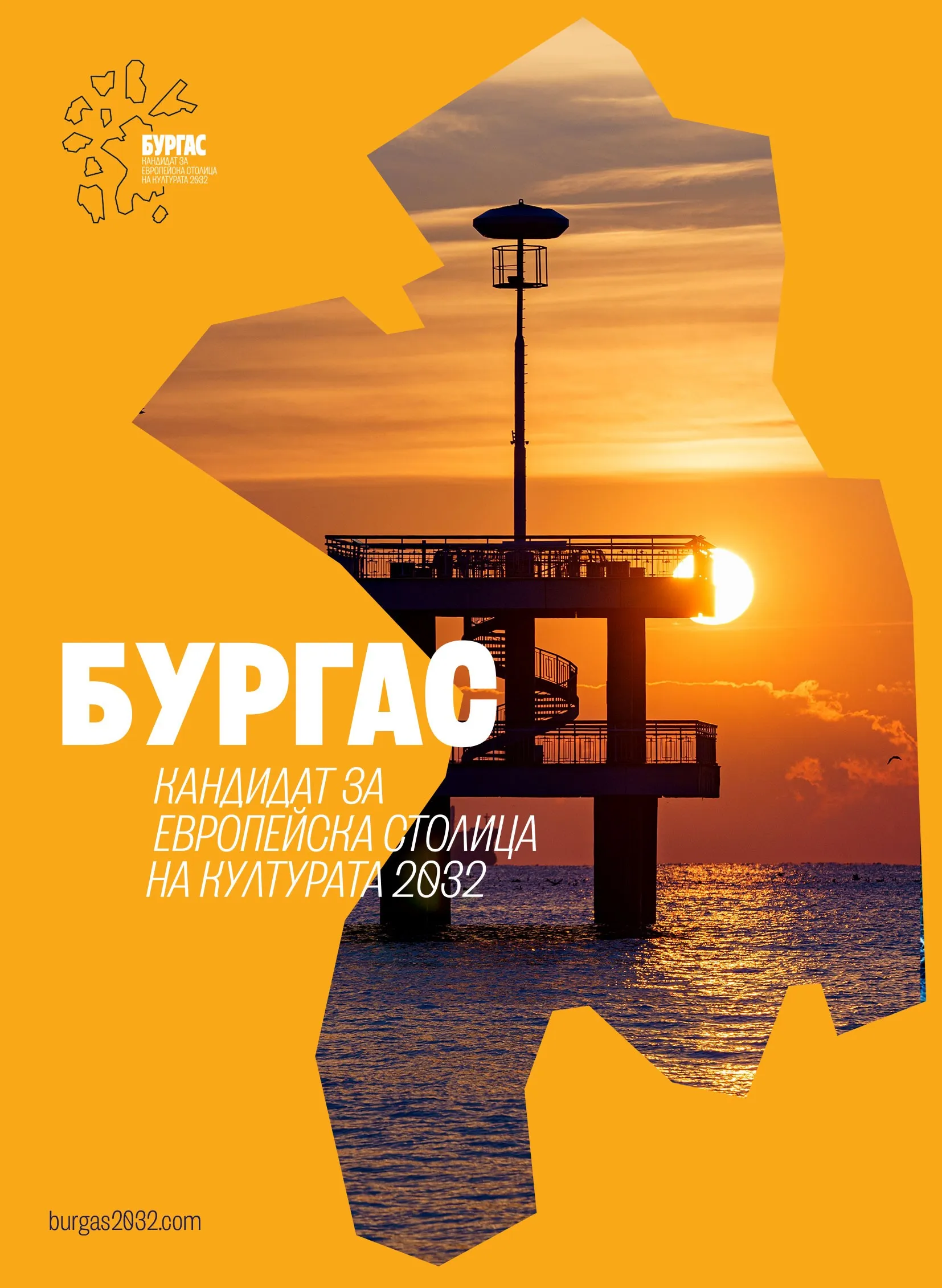

The message of the people of Burgas as the living heart of urban culture and the future development of Burgas lies at the center of the new visual identity for the 2032 European Capital of Culture candidacy. The official presentation of the main elements of the "Burgas 2032" brand gathered representatives of the cultural scene, media, and guests at the "Sea Casino" Cultural Center, with the focus placed on the active participation of the city's residents themselves in the campaign.
The event emphasized that the candidacy is built not only on infrastructure and programs but on people – their stories, professions, and daily lives, which form the true cultural fabric of Burgas.
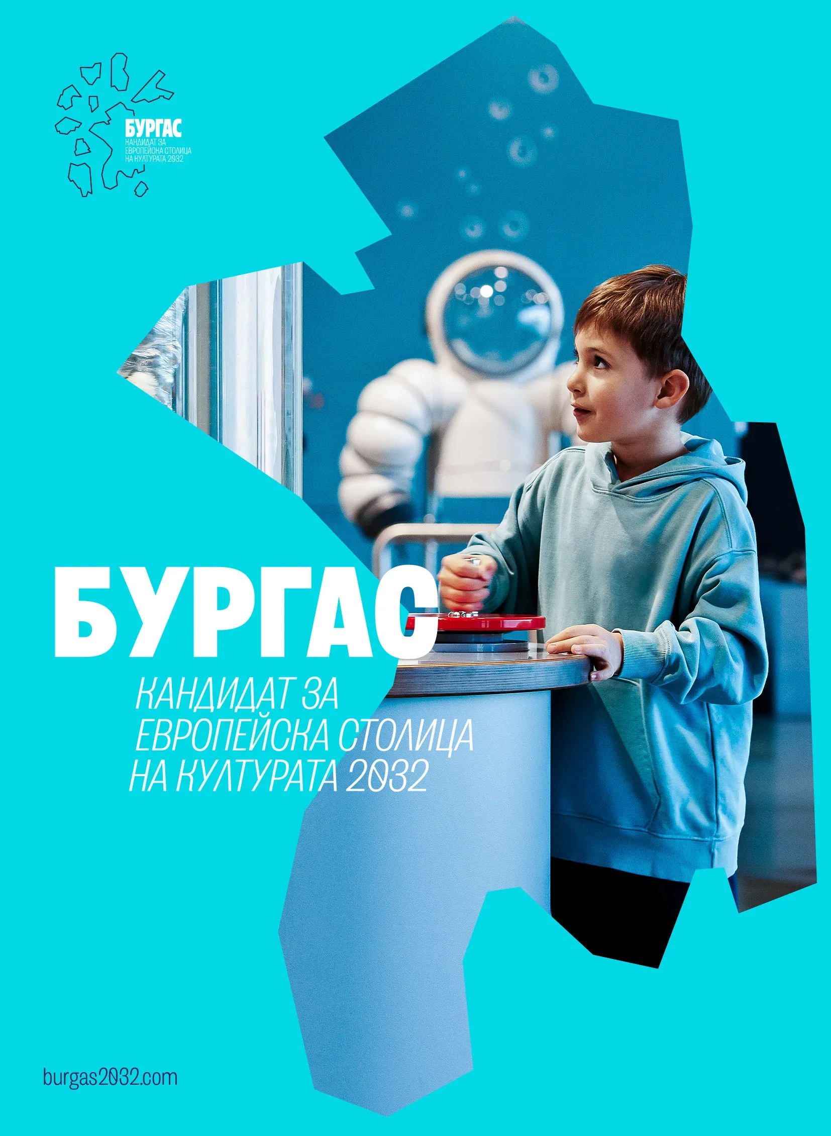
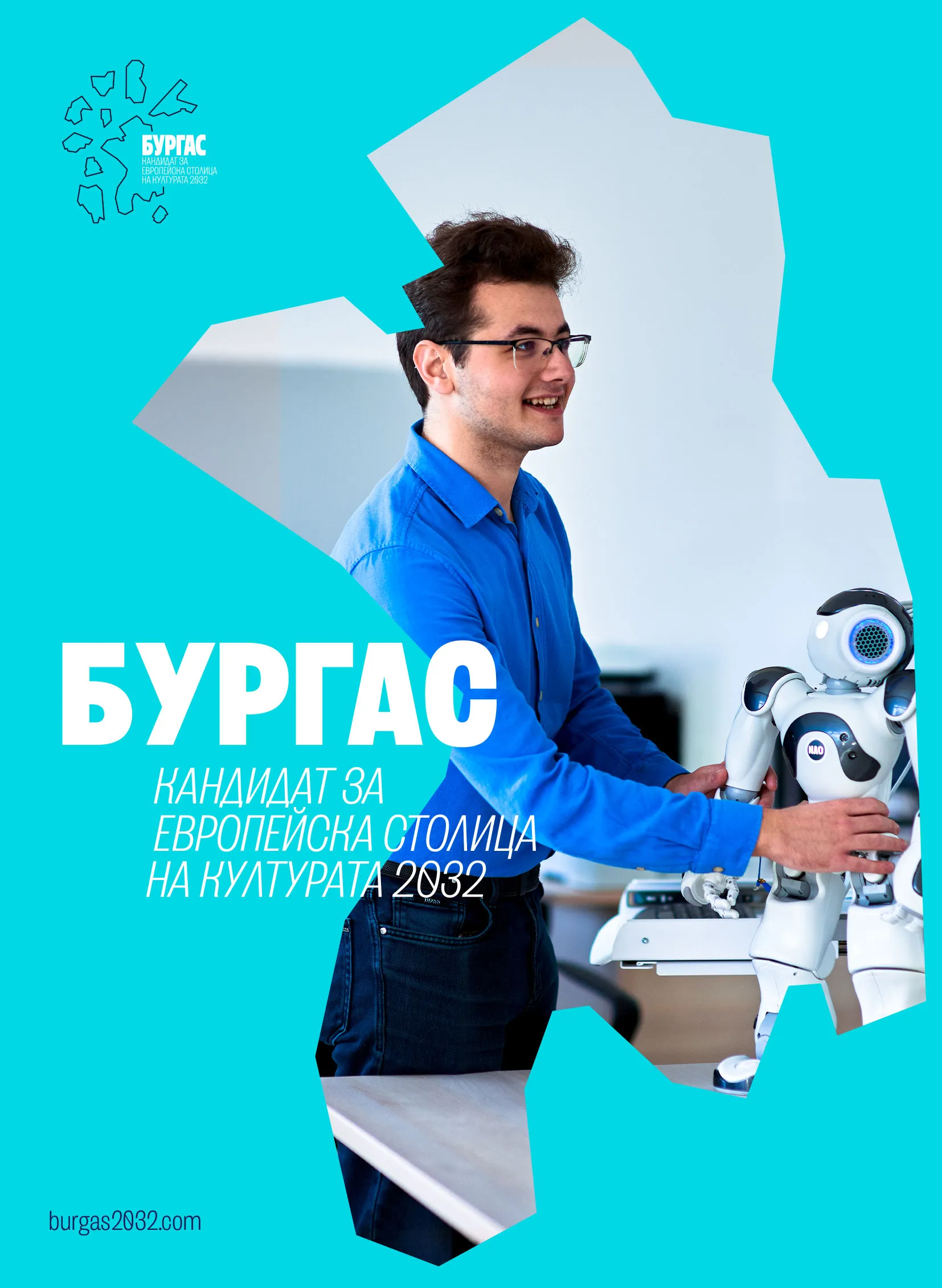
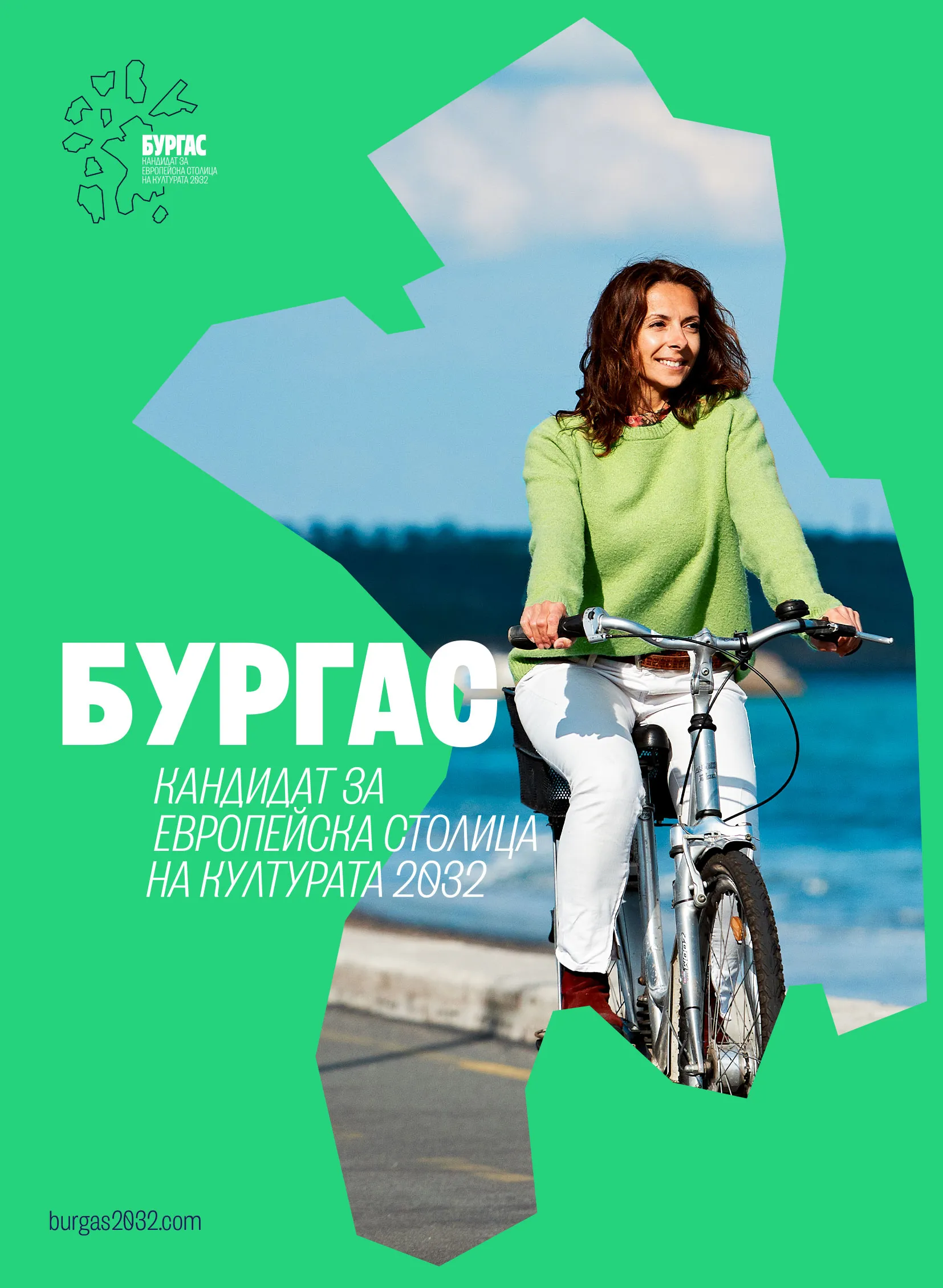
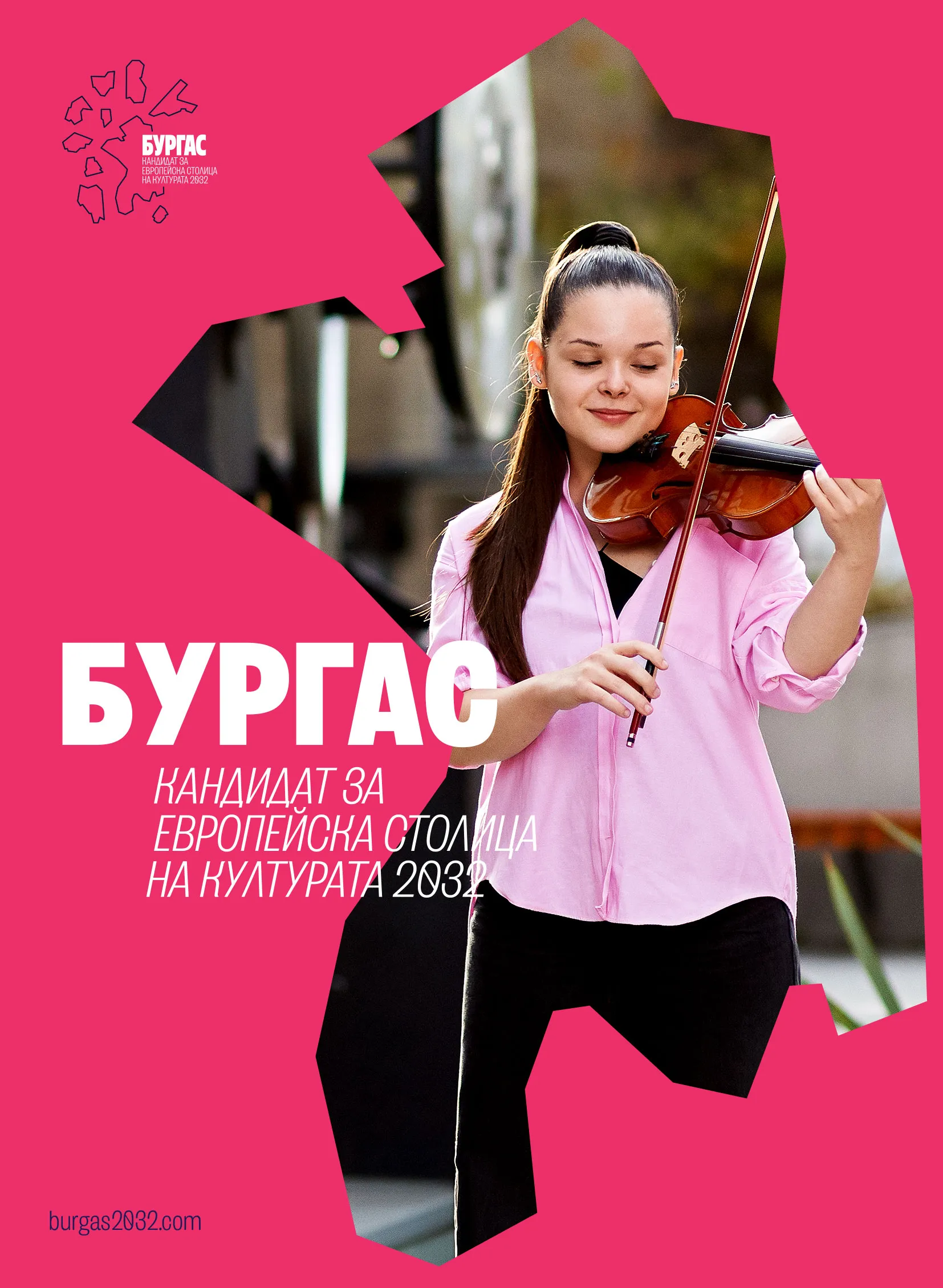
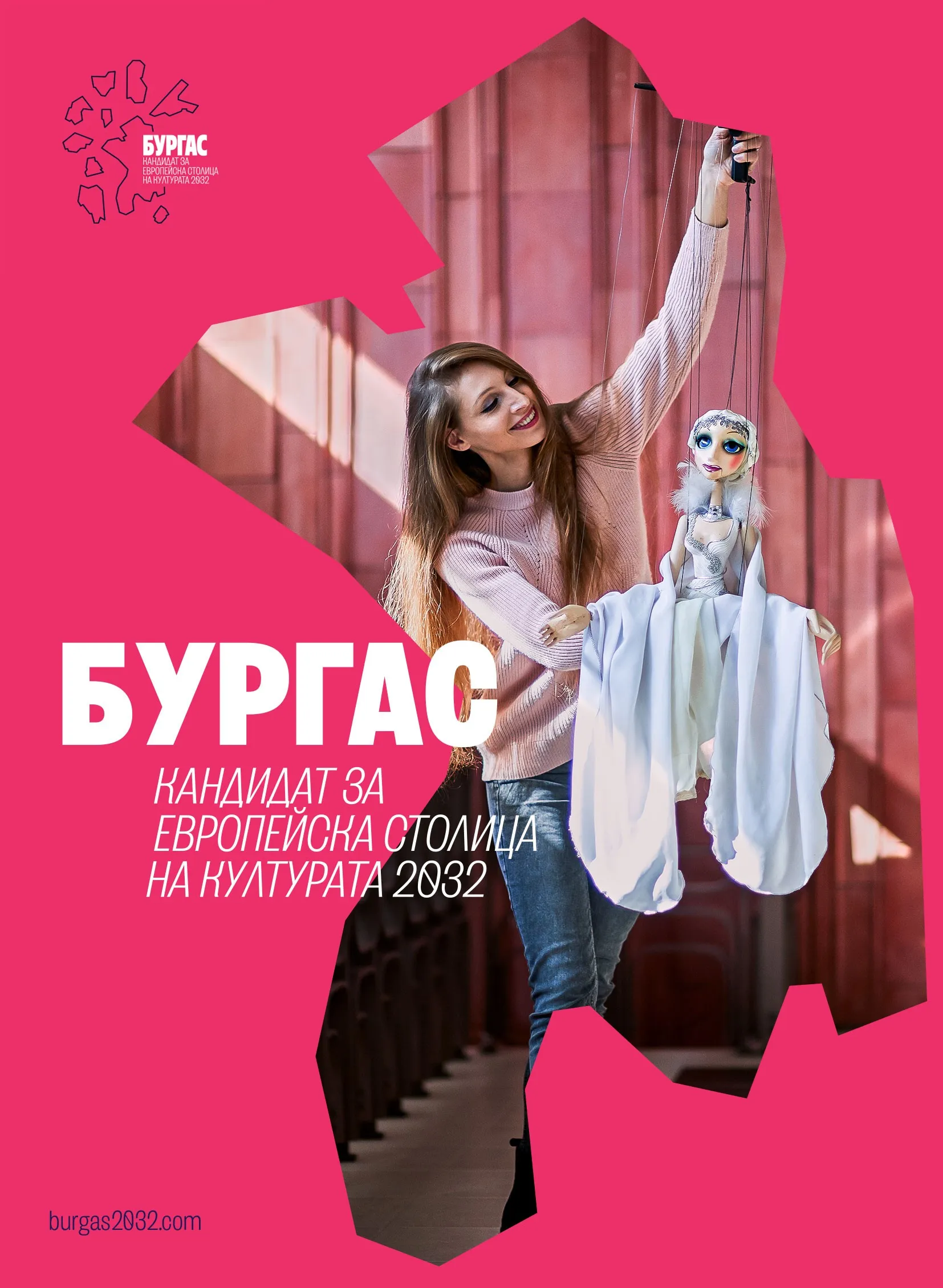
Real people from Burgas – faces of "Burgas 2032"
A special highlight of the presentation was the real people selected as the faces of the "Burgas 2032" visual identity. These are Burgas residents from different generations, neighborhoods, and professional fields who appear in the key visuals of the campaign and embody the city's living, multi-layered society.
Their presence during the premiere turned the graphic solutions into a human narrative – the candidacy does not show abstract models, but the "real people of Burgas," who create culture, community, and character for the place every day.
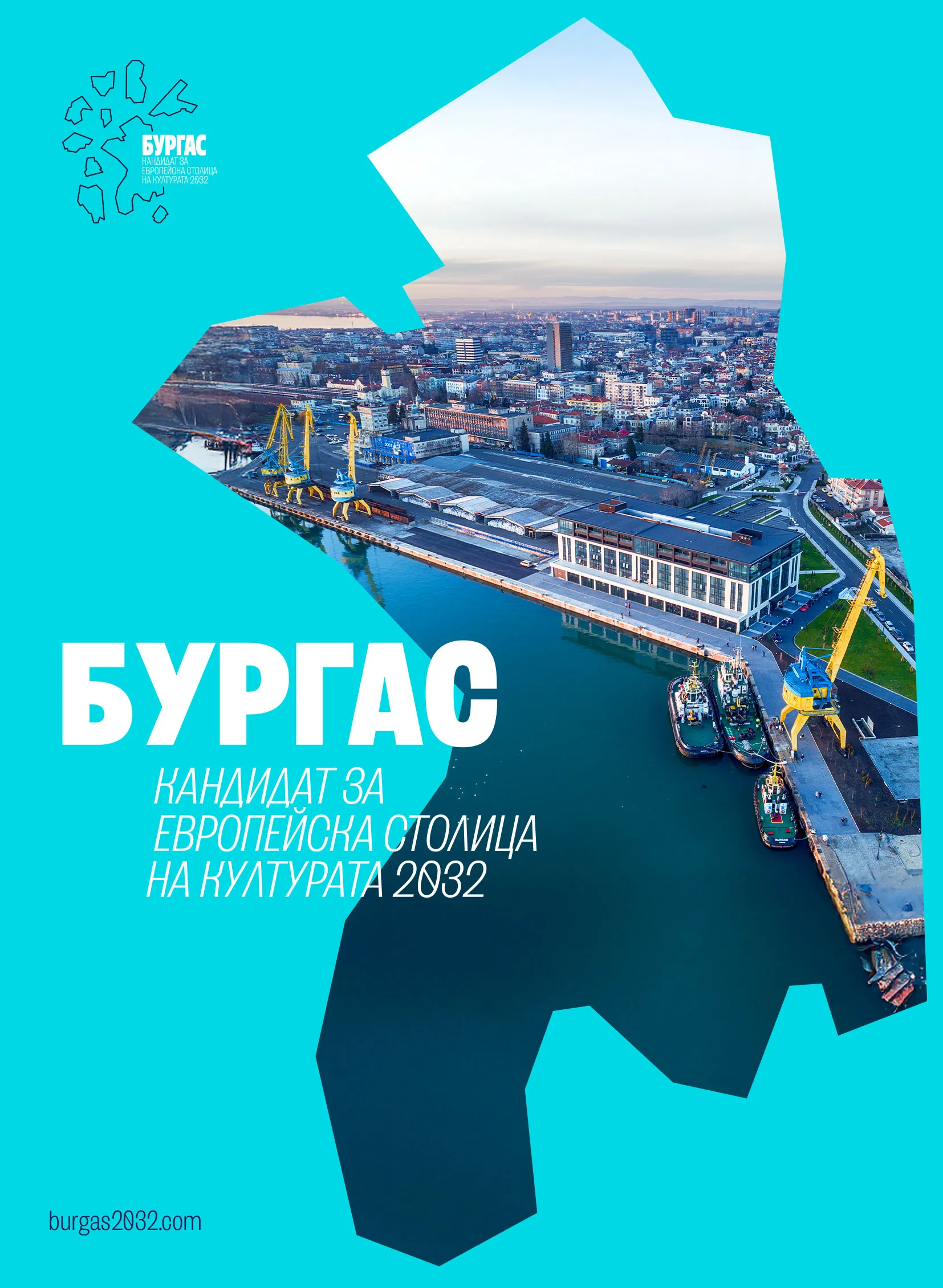
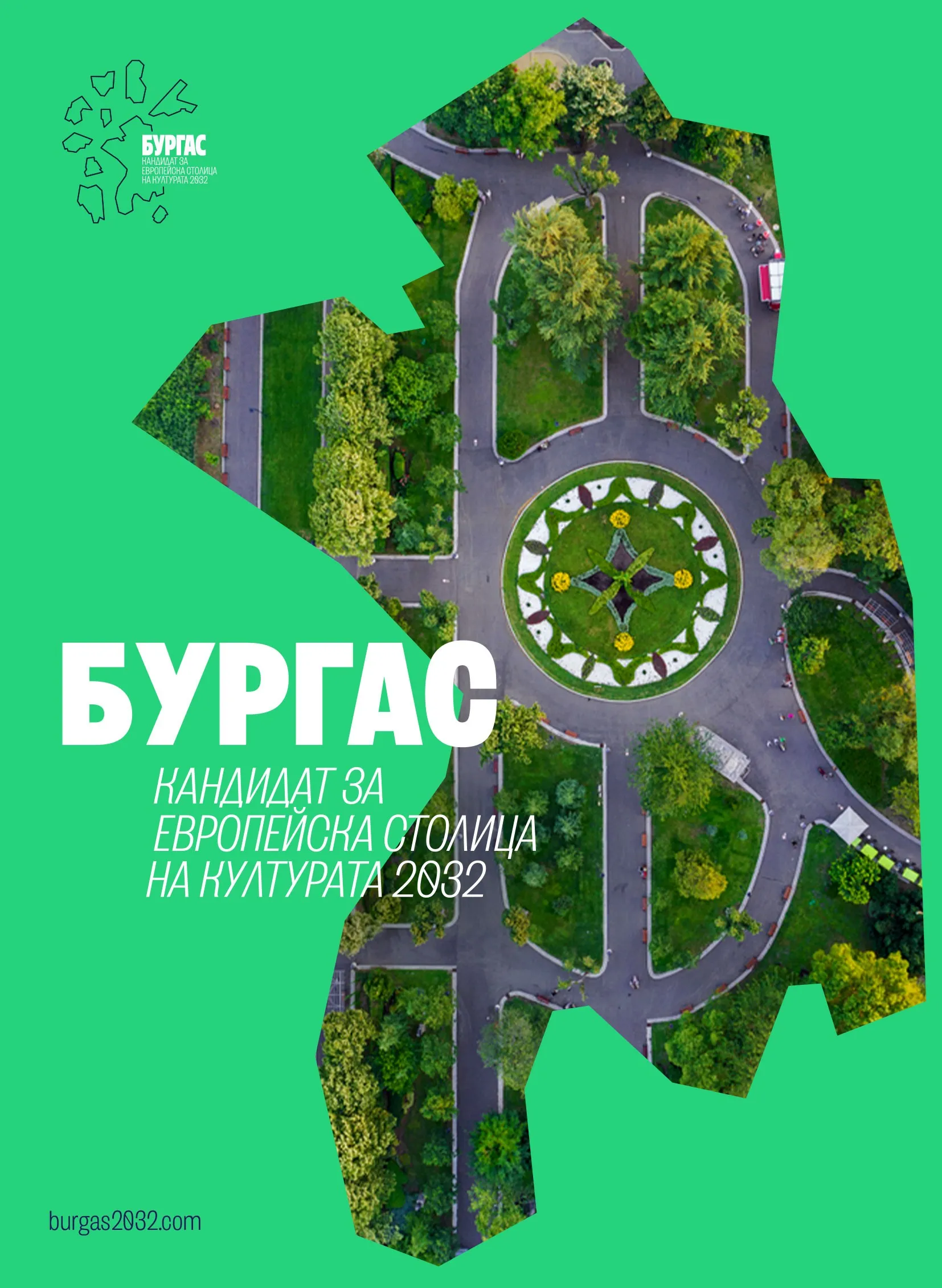
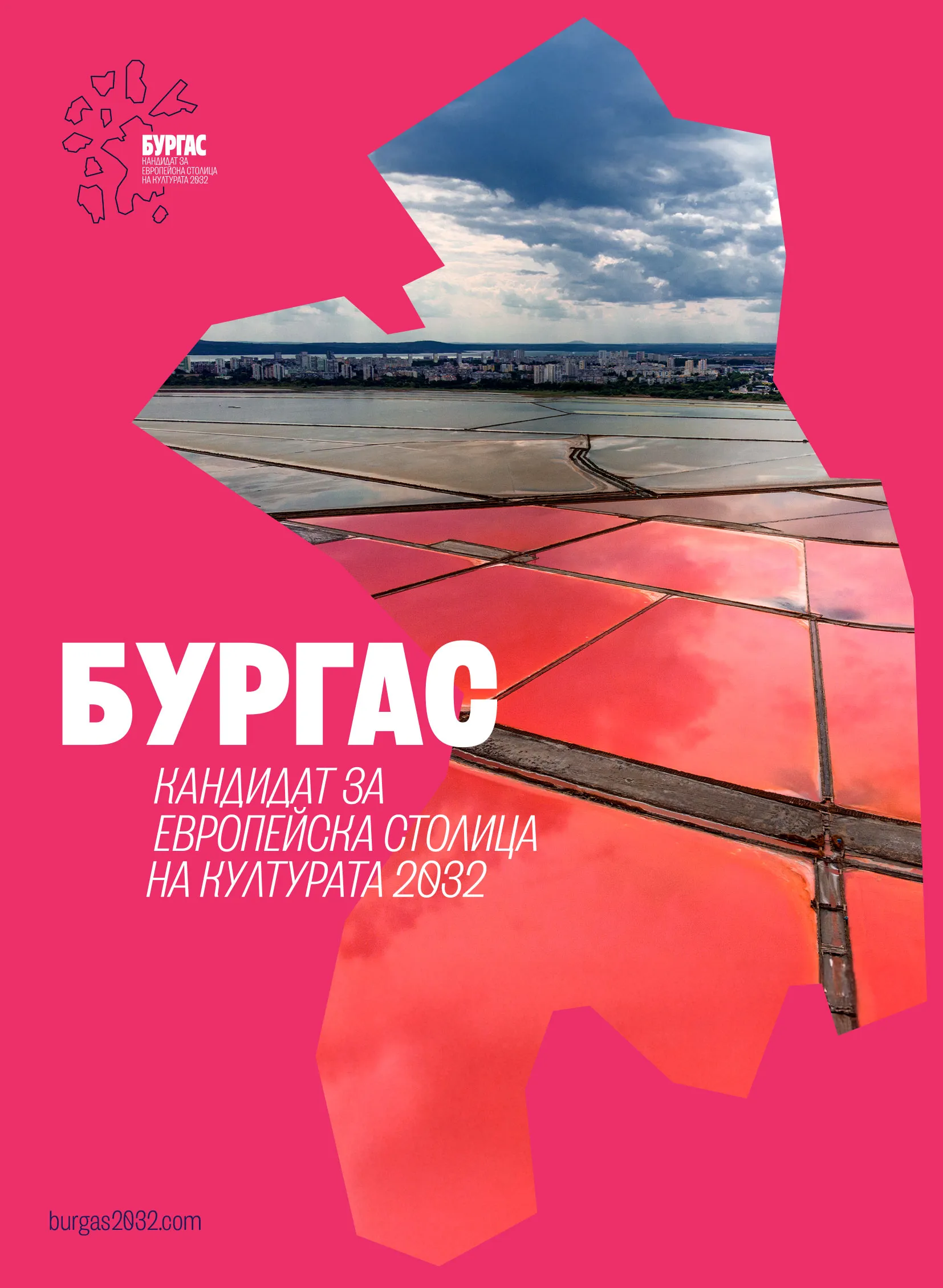
The city's silhouette as a frame for portraits
The brand's main visuals use the geographic silhouette of Burgas as a graphic frame in which portraits of people in their natural environment are "placed." Thus, the city is not just a background, but an organic part of the visual narrative – it outlines the contours, and the content consists of the faces and stories of the Burgas people.
This approach highlights the social energy, diversity, and authenticity of the community. The candidacy shows Burgas as a city where culture is born not only in halls and on stages, but in daily meetings, workspaces, neighborhoods, and people's free time.
The color language: blue, pink, yellow, and green
At the core of the visual identity is a bright and clearly structured color system, aimed at translating the complex idea of urban culture into an accessible visual language. Blue is chosen as a symbol of the future, innovation, and development – a nod to the modern, world-open Burgas. Pink marks the creative environment and cultural industries – music, theater, design, digital arts.
Yellow is dedicated to community and human interactions – events, festivals, meetings, informal networks. Green reflects the connection with nature and sustainable development – the sea, "Ezero" park, green zones, and environmental policies that are part of the city's vision. This color system builds a visual "dictionary" through which Burgas communicates its candidacy to the country and Europe.
The graphic element: connected neighborhoods, a common cultural space
The design of the main graphic mark is based on a stylized silhouette of Burgas, in which individual neighborhoods are represented as connected elements around a central form. This visually emphasizes the idea that the city is not divided into "center and periphery," but is a network of vibrant neighborhoods that together build a common cultural organism.
The concept emphasizes unity, sharing, and active participation – every neighborhood, every community, and every space has its contribution and place in the big picture. This also corresponds to the logic of the European Capital of Culture, where engagement is sought not only from institutions but also from citizens.
The ambition of "Burgas 2032": people as the engine of culture
With the new visual identity of the candidacy for the 2032 European Capital of Culture, Burgas clearly declares that it does not want to be perceived only as a stage where cultural events "happen." The message is that the city's people are the engine of cultural processes – they are creators, participants, and bearers of identity, not passive spectators.
You may also like
 We Are Human triumphs: Konstantin Trendafilov's agency wins the grand prize at FARA 2026
 Over 200 talents gather in Burgas for the 12th edition of "I Have a Gift"
 Days of Portuguese Culture in Burgas: Art, Language, and Cinema
 Burgas celebrates: 20th edition of "Joy on the Shore" with free admission
Through its graphic language, choice of colors, and real faces in the campaign, Burgas positions itself as a city where culture is created "from the bottom up" – through active communities, cooperation between institutions and citizens, and a shared sense of the future. This very message lies at the foundation of the visual identity with which "Burgas 2032" will present itself to Bulgaria and Europe.
Коментари (117)
Мидар
04.05.2026, 16:22Абе, пичове, вижте го т'ва! "Бургас 2032" яко се хванали да ни представят като нормални хора, а не само като сградички и бетон. Силуета на града – добре, ама тези портрети на реални бургазлии са готина идея, наистина. Дано не стане някаква евтина реклама, де!
cool_legend
04.05.2026, 16:24Абе Мидаре, браво! Напълно си прав! Много яко се е получило наистина, ама дано не стане както казват другите - реклама празна
Stoyan10
04.05.2026, 16:26Абе Мидаре, пичове всички! Прав си напълно, нещо много готино се опитаха да направат наистина! Тоя силует на Бургас с хората вътре - трогващо е, ей! И цветовете са свежи, не е някаква кичозна промоция
Мидар
04.05.2026, 16:26Мдааа... Мидар прав е, пич! "Яко се хванали" - точно така го усещам и аз. Хубаво е, че не са се заиграли само със скърцащи небостъргачи, ама к'ъв е смисъла на тия портрети? Да не им излезе като 💥
kvtx56
04.05.2026, 16:26Мидар прав си напълно! Браво на Бургас, че се опитват да покажат истинското лице на града – хората! Нека не е просто реклама, наистина, ама пък каква идея! Да видим реални истории и лица, а не само красиви сгради. Бурга
Луд_Българин
04.05.2026, 16:27ами верно, мидаре, добра идея са тия портрети - човешки лица вместо само архитектура. важно е да се покаже, че това е за хората в бургас и от хората в бургас
ultra_master451
04.05.2026, 16:39абе хораааа, харесва ми, сериозно! 😂 "бургас 2032" яко навлизат в играта за европейска столица на културата! тая визуална идентичност - да не е някаква шега? силуета на бургас... ок, готино е, признавам си. ама тези портрети на реални хора?! уау! 🤩 направо ми се усмихна, като го видях! дано не са избрали някви супер "модерни" лица, които никой да не познава, ами яко обикновени хора – баба пенка от пазара, бай мильо от блока
trmujk95
04.05.2026, 16:40Ама верно, яко изглежда! 👍 Хубаво е да виждаме обикновени хора, а не само
crazy_master949
04.05.2026, 16:40Браво Бургас, браво! 🇧🇬🇪🇺 Уникално е! Тея хора яко са го изми
super_angel
04.05.2026, 16:41абеее, сериозно ли?! 😂 "бургас 2032" ще разнесат европа, нали? тея портрети - бомба са, наистина! баба пен
Гечо
04.05.2026, 16:43Ааааа, хора, браво Бургас! 🤩🤩🤩 Сериозно, гледам тази визуална идентичност и просто... БРАВОООО! Да, тая "Бургас 2032" яко навлизат, не е шега работа. Ultra_master451 си прав - тия портрети на реални хора са СУПЕР! То точно това ни липсваше – да видят Европа, че има и истински хора тука, а не само модернистични архитектурни безизходици.
Yordan15
04.05.2026, 17:07Абе хора, сериозно ли?! "Визуална идентичност"... звучи все едно ще ни продават нов модел хладилник, а не кандидатура за европейска столица на културата. 😂 😁
Ралов
04.05.2026, 17:10Абе, Йордане прав се напълно! 😂 Т'ва "визуална идентичност" е яко, ама да не се окаже само за пред европейците... Важното е дали ще има реални промени и инвестиции в културата 🤙
64B07FC0
04.05.2026, 17:21Хм, интересно решение с акцент върху хората. Визуално добре из
Petar93
04.05.2026, 17:22Абе, визуална добре из, казваш? 🤣 Е, да де, кой не казва това?! Но сериозно, какво значи "хора в сърцето"? Ще има ли сърце от хора или просто някой дизайнер си е помислил, че е готино? Аз лично съм виждал по-готин дизайн за училищен бюфет, ама ха
D2F8F0A4D1
04.05.2026, 17:22абе хора, спокойно! разбирам притесненията ви, наистина е така, че често се случва да си направим едно хубаво представяне за европа, ама после… нищо. ама вижте го от друга гледна точка - фактът, че акцентът е върху *хората* е много важен! и аз съм за това да видим реални промени, не само красиви картинки, но и едно такова позициониране показва, че поне на ниво кандидатура се мисли за жителите на бургас
maria849@gmail
04.05.2026, 17:23абе, визуално добре ли из - да, ама хората наистина ли ще ги видят покрай всички политически циркове? 🤔 или просто ще е още един красив балон
Стелов
04.05.2026, 17:29Хм, ами дабре ли изглежда наистина или просто така правят всички? 🤔
Добър_Българин
04.05.2026, 17:31Абе, Стелов, добре си го казал! 🤔 Наистина ли всички правят така? Ама гледам я тая визуална идентичност и нещо ми топли сърцето, братче! Виж само – реални хора от Бургас, силуета на града... не е някаква абстракция, а показва корена ни, връз 🇧🇬
Стар_Реалист
04.05.2026, 17:31Абе, Стелов, питай го туй! 🤔 Дабре ли изглежда? Аз казвам - яко е! Сериозно! Вижте каква цветова система имат – свежо, младежко, не е като тия сиви и мрачни неща дето ги правиха преди. И нали реални хора са показали, а не някакви манекени или платени модели? Това ми харесва!
pesho789@gmail
04.05.2026, 17:33Абе то добре, де... ама наистина ли трябваше да ни снимат лицата на всички поредни? 😅 Не че имам нещо против Бургас, напротив, обичам моя град, ама чакай малко - това визуално ли е или просто реклама "Бургазлии са най-го
Честит_Бургазлия
04.05.2026, 17:34Абе, Стелов, "дабре" ли изглежда... хахаха, типично българско чувство за хумор! 🤔 Аз пък си мисля, че всички кандидати за столица на културата правят нещо подобно – визуална идентичност, такова-
18CC791B56
04.05.2026, 17:34Абе, Стелов, добро питаш! Дабре изглежда, ама аз нещо мн скептичен съм... Тия "визуални идентичности" все едно ни пробутват една нова дреха на стар халат. Яко е да има картинки, да пращаме снимки в Европа и да се хвалим пред тия оттам - да, ама к'во става с реалния живот?
Радар
04.05.2026, 17:38Абе тва с визуалната идентичност... Дали наистина ще се получи нещо яко или пак ще е пра
mega_hero
04.05.2026, 17:40Абе, Радар, здрасти! Прав си, винаги има шанс да стане прааа... ама пък гледам какво са измислили тия от Бургас 2032 – бая свежо изглежда, наистина. Не е като обичайните ни държавни проекти, дето
qngz175
04.05.2026, 17:42Абе Радаре, сериозно ли мислиш пак ще ни излъжат с
ultra_king639
04.05.2026, 17:38Абе, пичове... да, визуално е приятно, няма спор. Цветовете са свежи, хората... хубаво, че се опитват да покажат реални лица, а не само политиците. Но ме е страх дали това наистина ще пробие през шума. Все пак говорим за европейска кандидатура – трябва нещо наистина запомнящо се, нещо което да казва "Бургас" ясно и силно. Не просто хубава картинка... Да не стане
6F7341
04.05.2026, 17:42Абе, прав си ultra_king639 напълно! Хубава картинка е, нама спор, ама трябва нещо повече. Не иска
Georgi62
04.05.2026, 17:43Абе, браво Бургас! 🇧🇬 Много яко изглежда визуално
qhoj560
04.05.2026, 17:59Абе, викам си... Хубаво е, че се опитват да покажат града с лица. Честно казано, важното е дали наистина ще има нещо 😡
xgalj191
04.05.2026, 18:01Ех, пичове, какво да ти кажа... Разбирам ви напълно! Хубава картинка, хубави хора... ама все едно гледам реклама за кисело мляко - приятно е, ама после забравяш веднага. 😅
Стар_Патриот
04.05.2026, 18:09Абе, хора, да го кажа направо – леле мале! Викам си аз: "Бургас 2032"… Супер идея, ама хайде де! Цветове, силуети, реални лица… Абе визуално е яко, няма спор. Приятно е за окото, хубаво е, че не са измислили нещо супер откачено.
Yordan79
04.05.2026, 18:12Абе, Стар_Патриот, прав си! Яко изглежда яко, ама... кво праим кат стане истината? Да видим дали ше има някакви реални промени или ще е само за снимки в инстаграм. Не казвам
pro_angel624
04.05.2026, 18:14амиии... яко се постарали наистина. да видим дали ще има реални резултати за града ни, а
FAAFA1
04.05.2026, 18:20абе то хубаво е, че се опитват да го направят яко визуално, ама наистина ли ще има реални промени за хората в бургас или само ще е едно красивичко представяне? да не стане само за снимки 🙄
Болов
04.05.2026, 18:21А бе, кво стаа тука? Само за тикток ли е правено? 🤨
cool_legend913
04.05.2026, 18:21Абе FAAFA1, напълно си прав! Иначе ще стане кат' с Ковид мерките – едно "за снимки", да покажем на Европа че сме го направили! Да
7BD1B71AC7
04.05.2026, 18:20Абе, визуална идентичност... Силуети, хора... Яки цветове. Ама наистина ли ще привлече някой отвън? Или пък просто е за да си кажат, че се стараят? 🤨 Все пак Бурга 😏
real298@eu
04.05.2026, 19:12Абе, хубаво е, ама ще стане ли нещо от това накрая? Или само ще го хвалят
002F5F885A
04.05.2026, 19:13Абе, real298@eu, брато, прав си да се чудиш! Все тая какви там силуети и цветове ще бачкат, все пак важното е какво ще стане накрая. Ама виж сега, не бързай да хвърляш камъни. То тая кандидатура за Европейска столица на културата - голяма работа е! Не е само за красоти и реклами. Ако вземем титлата, значи пари ще валят за Бургас, проекти ще има, хора ще се върнат – все нещо хубаво
Vasil90
04.05.2026, 19:13Абе, real298@eu, баси, к'ви сте песимисти всички! Хубаво е да питаш, разбирам те напълно – много са ни излъгали до сега, ама тва с Бургас 2032 ми се струва друго нещо. Виждам, че се опитват да го направят с хора, а не само със сгради и бачкане! Силуета на града - добре, показваме откъде сме дошли. Портрети на реални хора – *това* е най-важното, бе! Да видим
Истински_Бургазлия
04.05.2026, 19:14Абе, real298@eu, прав си напълно! То винаги така става - хубави концепции, красиви картинки... ама после? Дано този път да не е само за "почеркване" и еврофондове за нещо друго. Все пак Бургас е важен град, има потенциал, а и Европа трябва да види, че и тука се полагат усилия. Стискаме палци да не се окаже само красива фасада, а наистина да има промяна към
gosho685@eu
04.05.2026, 19:16Абе, real298@eu, тц ти права си! Винаги е така
Ралов
04.05.2026, 19:59Абе, яко изглежда нали. Дано наистина са го помислили добре, а не просто да правят нещо "за
real891@mail
04.05.2026, 20:01Абе Рало, яко е наистина! 😉 Направо ме кефи, че са решили да ни включат в тая визия. Дано не стане кат' другите подобни истории - хубава картинка, ама празна отвътре.
Валов
04.05.2026, 20:03Абе, Рало, нали знаеш как са тия неща... Яко изглежда - да, ама докато го направят яко, ще мине време и пари много. Дано не стане кат с другите
5F8DFB46E5
04.05.2026, 20:08Ех... ама наистина ли е това, което ни трябва? Хубаво е, де, да има визия, да се прави нещо за града. Виж сега, може и да са го измислили добре. Портретите на хора - яко е, ако не е само за паради. Важното е да не стане просто една хубава картинка, а някаква реална промяна да има след това. Надявам се наистина да
13294BDF51
04.05.2026, 20:09айде пак... визуална идентичност, силуети, портрети... добре де, разбирам идеята – да покажат бургас с хората му, да е нещо човешко, а не просто бетон и пропаганда. но ме е страх дали наистина ще се получи нещо смислено, а не само красиво на хартия (или в дигиталния екран).
gosho449@eu
04.05.2026, 20:12Абе, господин коментар 13294BDF51, прав сте напълно! И аз си викам "айде пак" като чета за визуални идентичности... ама к'во да праим? Все пак, какво мислите – наистина ли няма място за малко оптимизъм? Да не би да сме станали твърде цинични, ей? 😅
ivan217@eu
04.05.2026, 20:13Абе хора, стига страхливци! Да, ясно е че може да стане "са
Добър_Човек
04.05.2026, 20:14Абе хора, стига сте хейтъри! Разбирам притеснението на човека, де, логично е да се чудим дали ще стане нещо повече от картинки. Ама ей, поне се опитват! Не може само с бетон и небостъргачи да правим държава, трябва и култура, и лица! И Бургас има какво да покаже - хора
super_king
04.05.2026, 20:40Сериозно ли това ще привлече туристи? 🧐 Няма лошо, ама дано не се окаже само за снимки
pesho558@abv
04.05.2026, 20:43Ааа, супер кинг, бате, к'ви туристи иска
redchpz861
04.05.2026, 20:44Абе, super_king, прав си да се замислиш. Важното е да не стане само Instagram "фотогения", а да има реално съдържание зад визията. Дано наистина
Petar44
04.05.2026, 20:44Абе, Super_king прав си... ама да не го казвам аз,
Луд_Реалист
04.05.2026, 20:58Евала за усилията, ама да не се окаже само гъзария. Важното е да има реални проекти зад тази "визуална идентичност", а не просто да ни правят на глупаци с красиви картин
Стар_Граждан
04.05.2026, 21:20Абе... хубаво си го направили, ама да не е само за фон на компютъра
Токо
04.05.2026, 21:23Абе хора, какво става с тая Бургас 2032? Визуална идентичност... ама сериозно ли? И аз съм за визията и гъзариите (както каза Луд_Реалист), но да не забравяме, че накрая трябва да има резултат
Ivan14
04.05.2026, 22:02Абе, добре де... ама нали нема да е само картинка? Да видим после проектите дали ше са хуба
pro_master713
04.05.2026, 22:07Абе брат, Иван14 е прав на 100%! Кар
Dimi17
04.05.2026, 22:07Евала, Иван14! Напълно си прав – картинките са едно, а реалните действия друго. Наистина се надявам това "Бургас 2032" да не е само готин логотип и някаква цветна презентация за еврочиновниците. Иначе ще стане като с тия другите кандидати - хубави обещания, а накрая – нищо.
685A675A
04.05.2026, 22:48Абе, хора, вижте го т'ва! Хубаво е, че се старат за Бургас, ама все пак... Дано не стане като тия други кандидати - хубави картинки, а кат’ дойдат изборите – нищо. Надявам се да има реални промени и
Yordan63
04.05.2026, 22:51Хм, интересно... Това с визията звучи добре, ама наистина ли ще се ВИДИ резултат? Нали няма да е само за красота, ами ще 😜
user562@mail
04.05.2026, 22:53абе, yordano63, к'во значи "дали ще се види резултат"? сериозно ли питаш?! все едно питаш дали ще изгрее слънцето утре! 🤦♂️ яко е, че се опитват да направят нещо за бургас и за българия въобще. да не сме затънали в някаква руска пропаганда де, ами да се покажем на европа какви можем да бъдем! визуална иденти
dark_wolf268
04.05.2026, 23:10Абе, хубава визия... ама наистина ли ще е ориентирана към хората, а не само към красиви картинки? Дано не стане поредният проект "за показ", нали така? 🤔
gosho109@gmail
04.05.2026, 23:13Ех, dark_wolf268, прав си на 100%! Визията - ок, ама да не стане като с тия магистрали... красота 🙄
pesho305@mail
04.05.2026, 23:15Абе, к'во значи "поставя хората в сърцето"? Трябва да го докажат с факти, а 😅
Petar99
04.05.2026, 23:12Абе хора, здравейте. Четях новината за Бургас 2032 и викам си... все пак, добре е, че се опитват да представят града по-различно. Тая "визуална идентичност" – звучи малко претенциозно, признавам си, ама като гледам картинките, не са лоши. Портретите на реални хора ми харесаха най-много, все пак това е важното – да се види, че за хората ста
Лош_Софиянец
04.05.2026, 23:18абе, пичове... чета коментарите и се замислям. бургас 2032... добре е, че се хващат за нещо да го изстрелят града напред. тая визуална идентичност дето я правят – все пак, хубаво е да има идея. ама тая картинка с "хората в сърцето"... не ми е ясно дали наистина ще го има това "сърце".
real181@bg
04.05.2026, 23:20ааа, "сърце"... хахха... абе, викам си аз, ама да
879CA35849
04.05.2026, 23:22Ей, Лош_Софиянец, прав си за "сърцето"... ама то все тая до някъде. Важно е да има нещо различно, нещо което да ни отличи от другите градове. Все пак Бургас е готин град и заслужава да се развива! Надявам се да не стане като с други подобни инициативи - мн шум и после нищо. Дано наистина вложат пари и енергия, че да видим
Вадар
04.05.2026, 23:19Абе хора... чета коментари, чета новината за Бургас 2032... Все едно сме на балонички! Разбирам ентусиазма, все пак е добре да има подобни инициативи. Нооо... малко ме е страх, не искам да звучи тъмно ама... 🇧🇬
3EA4AA33
04.05.2026, 23:20Абе Вадар, я те разбрах напълно! То
Нимир
04.05.2026, 23:31Браво Бургас! 🤩 Супер яко, че се залага на местните хора в визията за 2032! Това е важното - да покажем истинското лице на
Гечев
04.05.2026, 23:35Абе, сериозно ли? "Истинското лице на Бургас" през силуети и портрети? 🤨 Нама ли нещо по-оригинално? Да не са ги избрали тия хора заради най
Толов
04.05.2026, 23:41Ааа, Бургас 2032... Хубаво е, че го правят, ама да не 👍
Рачев
04.05.2026, 23:49абе хора, вие го гледате ли тоа бургас 2032? наистина ли си представяме, че можем да се кандидатираме за европейска столица на културата?! браво на организаторите, че поне нещо правят! визуална идентичност, силуети, хора... ама не е ли малко наивно? 🔥
ftttlvt188
05.05.2026, 00:50Евала на Бургас! 👍 Добре е, че се опитват да направят нещо за града и да покажат какво имат. Визуално ми изглежда добре - цветовете са свежи, а това с хората е яко, наистина. Да не е само за парадиране пред Европа, да се надяваме, че ще има реални промени покрай тая кандидатура! Дано да успеят и да ни направят горди! ❤️
ivan929@eu
05.05.2026, 01:01Абе ТО хубаво, ама наистина ли това са най-интересните хора в Бургас? 😅 Цветовете ок
user217@gmail
05.05.2026, 01:02Мамка му! Сериозно, това ли са "най-интересните"?! 🤦♂️ Абе хора, дайте малко
Нидар
05.05.2026, 01:10абе пичове, викам, добра идея с хората в кадър! наистина личи, че искат да покажат,
BB56DF7478
05.05.2026, 01:48Абе, здравейте вси4ки! 😃 Видях новината за "Бургас 2032" и викам си - добре, че се опитват! Важно е да има инициативи, ами то иначе как ще мърдаме от тука мястото.
Прав_Реалист
05.05.2026, 01:52Абе, BB56DF7478, здрасти и ти! 😃 "Добре, че се опитват", казваш... Браво на тях, де! Ама виж сега, наистина ли ни трябва нова визуална идентичност, за да си покажем хората? Не можеше ли просто да организират един нормален концерт на Гребния канал и да видят дали има народ 😏
Ivan74
05.05.2026, 02:18Хубаво звучи идеята с акцента върху хората, наистина ли ще се почувства това като истинска връзка с бурга
maria595@bg
05.05.2026, 02:18Абе хора, вие го гледате ли тоз' дизайн? Сериозно, май се опитват да го измислят с тия "реални хора"... Ама наистина ли си представихте кво ще стане ако всички кандидати за столица на културата започнат да лепят снимки на случайни минувачи? Ще стане цирк, баси! 🤦♀️
70E0E91EEB
05.05.2026, 02:22абе, мария, права си... 🤦♀️ то е все тая накрая. винаги нещо намират да ни подхлъ
cool_master337
05.05.2026, 02:52Ааа, "хора в сърцето"... Да видим дали ще е само за снимките или наистина нещо реално ще се случи. Често така става – хубави обещания, а накрая пак прах и мъгла. Иначе -
Млад_Патриот
05.05.2026, 03:00абе, тва с "хората в сърцето" звучи яко, ама нека да не е само за красота! да видим дали наистина ще има нещо различно, някакви истински проекти за хората,
8824E7733D
05.05.2026, 03:04Млад_Патриот, прав си! Съгласен съм с теб напълно. "Хората в сърцето" е хубаво като лозунг, ама трябва да има реални действия зад него. Да не се окаже само красива картинка и приказки. Надявам се наистина да видим 😡
Ivan66
05.05.2026, 03:21Абе, ТО хубаво де, "хора в сърцето"... ама к'ва е тая идея да лепят снимки на хора? Наистина ли това ще ни направи столица на културата
Тослав
05.05.2026, 03:23Хм... Визуално изглежда добре, да. Да видим дали ще е нещо повече от хубав дизайн, де. Важно
dark_master
05.05.2026, 03:25Ахаха, Тославе прав си, важно е да видим дали ще има
mega_king544
05.05.2026, 03:26Абе Тослав, прав си, разбира се! Хубав дизайн е, няма спор. Ама дано не е само за показ – все пак европейската столица на културата е сериозна работа 🙄
htciz90
05.05.2026, 03:52Абе, викам си... снимки на хора? Сериозно ли? Хубав дизайн е, няма спор, ама да не стане като с всичките други "нови" концепции - хубаво изглеждат на картинка, а после нищо не става. Дано поне не са взели някви случайни хора от улицата и сега им плащат по 1
Yordan35
05.05.2026, 04:18Ааа, снимки на хора... Дано не са избрали най-готините само, че да изглежда
real489@gmail
05.05.2026, 04:21Евала за визуалната идентичност, ама Yordan35 е прав! Много съм нервен дали наистина ще е представителна извадка от хората в Бургас. Все пак говорим за кандидатстване пред Европа! Нека не се окаже, че са си подбрали само "най
pesho50@abv
05.05.2026, 04:28Абе, вие хора какво се панирате? Снимки на хора... нормално е да има. Т'ва е за да покажат, че кандидатстват отдолу, от народа, а не някакви там чиновници в кабинети. Хубаво е, че са използвали реални бургазлии, ама дано наистина са избрали хора, които имат нещо общо с културата на града, а не само за красота. Важното е
zqppr230
05.05.2026, 04:32абе, баси... "хора в сърцето"... ама чакай малко, наистина ли това е най-якото, което измислиха? снимки на хора? добре де, щом ще има хора, поне да са някви нормални, а не манекени от реклама. дано не се окаже, че половината са модели и платени, а другите - роднини на някой важен. като гле
vphl409
05.05.2026, 05:49Идеята е добра, ама да видим дали ще се превърне в нещо повече от хубава картинка
gosho950@bg
05.05.2026, 05:52Абе, верно ли е, че ще има реални хора в тая визуална идентичност, или пак ще се окаже само за пред камерите? Честно казано, малко ме съмнява дали наистина са се замислили кво искат да покажат. Дано не стане като с другите кампании - хубави обещания и картинки, а накрая... нищо. Пък и да си призная,
Ивадар
05.05.2026, 05:59Абе, пичове, вижте сега к'во! "Хора в сърцето"... ама наистина ли това е голямата новост? Силуета на Бургас, добре де, нормално е да покажат града, ама снимките... снимки на хора?! Да не ни правят за смях, бе?
user32@abv
05.05.2026, 07:49Ей, здравейте! Честно казано, като гледам тая новина и коментарите... ама ми става яко мъчно, бе. Разбирам скептицизма на хората. Все пак сме свикнали да ни разочароват.
wcpgxz976
05.05.2026, 08:38Абе, здравейте на всички. Видях новината за "Бургас 2032" и... ама честно, все едно гледам реклама на нещо, което може да е или много яко, или пък голяма прахосана работа.
fan243@mail
05.05.2026, 08:54абе хора, ама много яко! бургас 2032 – звучи сериозно. хубаво е, че ак
bg778@abv
05.05.2026, 09:13Абе, наистина ли само това ли ще ни спаси? Или пък е доб
bg622@gmail
05.05.2026, 09:39Абе т'ва с силуетите и цветовете - яко е, ама наистина ли ще промени нещо? Или
fan482@eu
05.05.2026, 09:40Абе т'ва "яко е, ама..." - кво значи? Ще стане ли Бургас като София - само красоти на повърхността и нищо друго?! Дано поне да има реални промени за хо
Истински_Софиянец
05.05.2026, 11:00Хм.. яко изглежда визуално, ама дали наистина ще се усети нещо различно в града? Да
32651B
05.05.2026, 11:04Ами, да... Визуално определено изглежда добре, няма спор. Но това ли ще е достатъчно? Дали просто не са вложили много усилия във външния вид, а по същество ще остане все едно нищо не се е промени
Гедар
05.05.2026, 12:01абе, пичове, вие си знаете аз съм човек от народа, ама да кажа - яко е! сериозно, гледам тия снимки и абе нещо ми харесва. не че съм голям фен на тези "столици на културата" – все тая дали сме столица или не, пак ще си копаем ями (хаха, извинете за цинизма)
Georgi7
05.05.2026, 12:31ахах, "хората в сърцето на кандидатурата"... звучи много добре на теория! да видим дали ще видят тези хора и нещо друго освен снимките, де. сериозно, дано поне бюджета е разходен разумно. не ИСКА 😅
Ivan81
05.05.2026, 12:43Ей, здравейте! 🤩 Видях новината за визуалната идентичност на "Бургас 2032" и наистина останах впечатлен! Браво на екипа – много свежо и модерно изглежда, ами аз лично намирам за страхотно, че акцентът пада върху хората. Това, че са използвали реални бургазлии на снимките, ми се вижда супер идея – да покажат лицето на града, да не е само някаква абстрактна концепция.
Гедар
05.05.2026, 12:53Визуално е добре. Важно е да се види как ще се приложи на практика. Дано не стане само за гъз
Истински_Патриот
05.05.2026, 13:05Абе хора, к'во става?! 😅 Видях новината с Бургас 2032 и... признавам си, приятно ми е на очите! Сериозно, дизайнът им изглежда доста добре - модерно, свежо, не е някаква типична "държавна" работа. И тая идея с реални хора да се появят – топчето е!
Мино
05.05.2026, 13:07Абе, здравейте на всички! Разбирам ентусиазма, наистина. Визуалната идентичност изглежда обещаващо – има свежест, модерност... нещо, което напоследък рядко се вижда у нас. И тази идея с реални хора, както отбелязаха, е добра, да придаде човешко лице на цялата работа.
Честит_Граждан
05.05.2026, 13:14хм... хубаво изглежда, наистина. да видим дали ще има някаква реална полза за бургас от тая европейска столица на културата, а не само красиви
super_hero689
05.05.2026, 14:14Добър ден, колеги.